Note: This tutorial was generated from an IPython notebook that can be downloaded here.
Fitting a model to data
If you’re reading this right now then you’re probably interested in using emcee to fit a model to some noisy data. On this page, I’ll demonstrate how you might do this in the simplest non-trivial model that I could think of: fitting a line to data when you don’t believe the error bars on your data. The interested reader should check out Hogg, Bovy & Lang (2010) for a much more complete discussion of how to fit a line to data in The Real World™ and why MCMC might come in handy.
The generative probabilistic model
When you approach a new problem, the first step is generally to write down the likelihood function (the probability of a dataset given the model parameters). This is equivalent to describing the generative procedure for the data. In this case, we’re going to consider a linear model where the quoted uncertainties are underestimated by a constant fractional amount. You can generate a synthetic dataset from this model:
import numpy as np
import matplotlib.pyplot as plt

np.random.seed(123)

# Choose the "true" parameters.
m_true = -0.9594
b_true = 4.294
f_true = 0.534

# Generate some synthetic data from the model.
N = 50
x = np.sort(10 * np.random.rand(N))
yerr = 0.1 + 0.5 * np.random.rand(N)
y = m_true * x + b_true
y += np.abs(f_true * y) * np.random.randn(N)
y += yerr * np.random.randn(N)

plt.errorbar(x, y, yerr=yerr, fmt=".k", capsize=0)
x0 = np.linspace(0, 10, 500)
plt.plot(x0, m_true * x0 + b_true, "k", alpha=0.3, lw=3)
plt.xlim(0, 10)
plt.xlabel("x")
plt.ylabel("y");
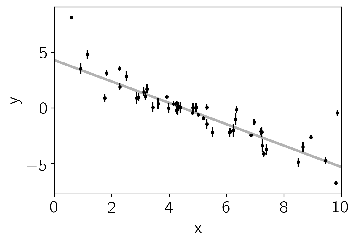
The true model is shown as the thick grey line and the effect of the underestimated uncertainties is obvious when you look at this figure. The standard way to fit a line to these data (assuming independent Gaussian error bars) is linear least squares. Linear least squares is appealing because solving for the parameters—and their associated uncertainties—is simply a linear algebraic operation. Following the notation in Hogg, Bovy & Lang (2010), the linear least squares solution to these data is
A = np.vander(x, 2)
C = np.diag(yerr * yerr)
ATA = np.dot(A.T, A / (yerr ** 2)[:, None])
cov = np.linalg.inv(ATA)
w = np.linalg.solve(ATA, np.dot(A.T, y / yerr ** 2))
print("Least-squares estimates:")
print("m = {0:.3f} ± {1:.3f}".format(w[0], np.sqrt(cov[0, 0])))
print("b = {0:.3f} ± {1:.3f}".format(w[1], np.sqrt(cov[1, 1])))

plt.errorbar(x, y, yerr=yerr, fmt=".k", capsize=0)
plt.plot(x0, m_true * x0 + b_true, "k", alpha=0.3, lw=3, label="truth")
plt.plot(x0, np.dot(np.vander(x0, 2), w), "--k", label="LS")
plt.legend(fontsize=14)
plt.xlim(0, 10)
plt.xlabel("x")
plt.ylabel("y");
Least-squares estimates:
m = -1.104 ± 0.016
b = 5.441 ± 0.091
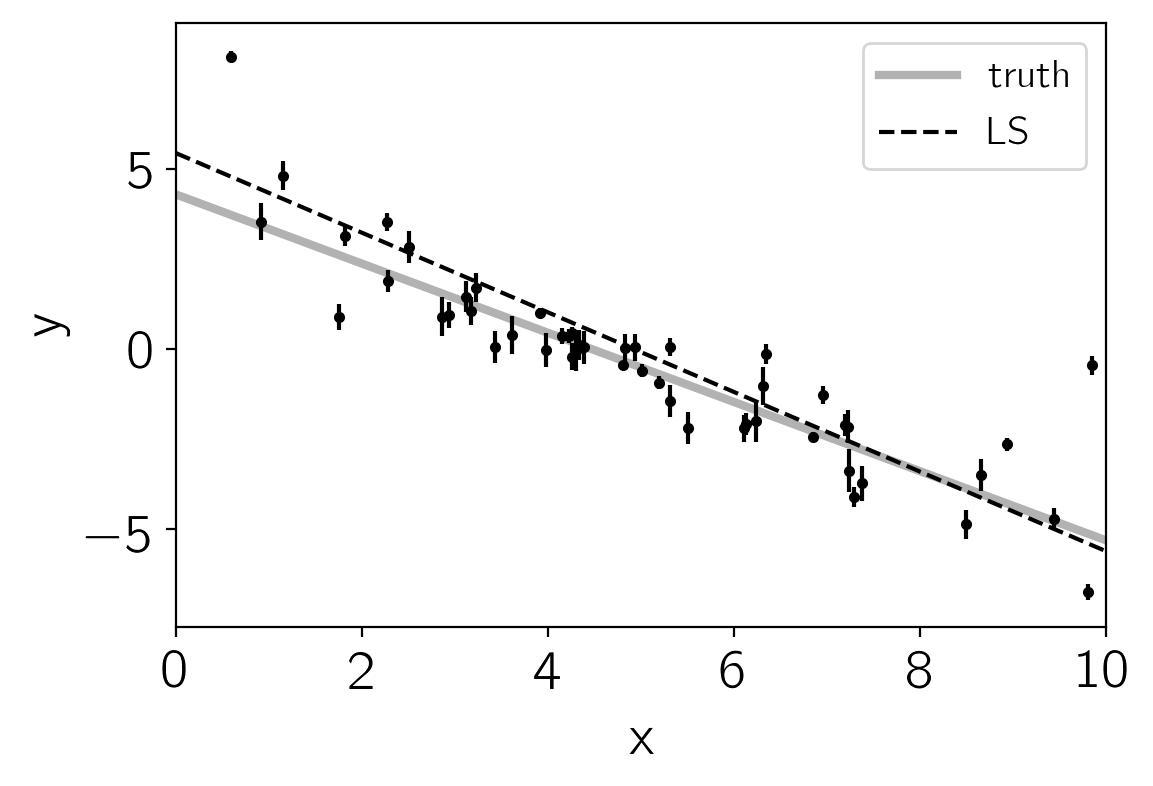
This figure shows the least-squares estimate of the line parameters as a dashed line. This isn’t an unreasonable result but the uncertainties on the slope and intercept seem a little small (because of the small error bars on most of the data points).
Maximum likelihood estimation
The least squares solution found in the previous section is the maximum likelihood result for a model where the error bars are assumed correct, Gaussian and independent. We know, of course, that this isn’t the right model. Unfortunately, there isn’t a generalization of least squares that supports a model like the one that we know to be true. Instead, we need to write down the likelihood function and numerically optimize it. In mathematical notation, the correct likelihood function is:
where
This likelihood function is simply a Gaussian where the variance is underestimated by some fractional amount: \(f\). In Python, you would code this up as:
def log_likelihood(theta, x, y, yerr):
    m, b, log_f = theta
    model = m * x + b
    sigma2 = yerr ** 2 + model ** 2 * np.exp(2 * log_f)
    return -0.5 * np.sum((y - model) ** 2 / sigma2 + np.log(sigma2))
In this code snippet, you’ll notice that we’re using the logarithm of \(f\) instead of \(f\) itself for reasons that will become clear in the next section. For now, it should at least be clear that this isn’t a bad idea because it will force \(f\) to be always positive. A good way of finding this numerical optimum of this likelihood function is to use the scipy.optimize module:
from scipy.optimize import minimize

np.random.seed(42)
nll = lambda *args: -log_likelihood(*args)
initial = np.array([m_true, b_true, np.log(f_true)]) + 0.1 * np.random.randn(3)
soln = minimize(nll, initial, args=(x, y, yerr))
m_ml, b_ml, log_f_ml = soln.x

print("Maximum likelihood estimates:")
print("m = {0:.3f}".format(m_ml))
print("b = {0:.3f}".format(b_ml))
print("f = {0:.3f}".format(np.exp(log_f_ml)))

plt.errorbar(x, y, yerr=yerr, fmt=".k", capsize=0)
plt.plot(x0, m_true * x0 + b_true, "k", alpha=0.3, lw=3, label="truth")
plt.plot(x0, np.dot(np.vander(x0, 2), w), "--k", label="LS")
plt.plot(x0, np.dot(np.vander(x0, 2), [m_ml, b_ml]), ":k", label="ML")
plt.legend(fontsize=14)
plt.xlim(0, 10)
plt.xlabel("x")
plt.ylabel("y");
Maximum likelihood estimates:
m = -1.003
b = 4.528
f = 0.454
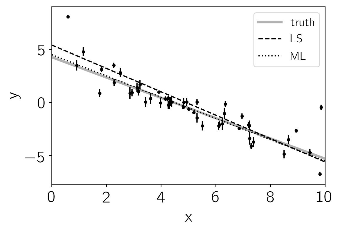
It’s worth noting that the optimize module minimizes functions whereas we would like to maximize the likelihood. This goal is equivalent to minimizing the negative likelihood (or in this case, the negative log likelihood). In this figure, the maximum likelihood (ML) result is plotted as a dotted black line—compared to the true model (grey line) and linear least-squares (LS; dashed line). That looks better!
The problem now: how do we estimate the uncertainties on m and b? What’s more, we probably don’t really care too much about the value of f but it seems worthwhile to propagate any uncertainties about its value to our final estimates of m and b. This is where MCMC comes in.
Marginalization & uncertainty estimation
This isn’t the place to get into the details of why you might want to use MCMC in your research but it is worth commenting that a common reason is that you would like to marginalize over some “nuisance parameters” and find an estimate of the posterior probability function (the distribution of parameters that is consistent with your dataset) for others. MCMC lets you do both of these things in one fell swoop! You need to start by writing down the posterior probability function (up to a constant):
We have already, in the previous section, written down the likelihood function
so the missing component is the “prior” function
This function encodes any previous knowledge that we have about the parameters: results from other experiments, physically acceptable ranges, etc. It is necessary that you write down priors if you’re going to use MCMC because all that MCMC does is draw samples from a probability distribution and you want that to be a probability distribution for your parameters. This is important: you cannot draw parameter samples from your likelihood function. This is because a likelihood function is a probability distribution over datasets so, conditioned on model parameters, you can draw representative datasets (as demonstrated at the beginning of this exercise) but you cannot draw parameter samples.
In this example, we’ll use uniform (so-called “uninformative”) priors on \(m\), \(b\) and the logarithm of \(f\). For example, we’ll use the following conservative prior on \(m\):
In code, the log-prior is (up to a constant):
def log_prior(theta):
    m, b, log_f = theta
    if -5.0 < m < 0.5 and 0.0 < b < 10.0 and -10.0 < log_f < 1.0:
        return 0.0
    return -np.inf
Then, combining this with the definition of log_likelihood from
above, the full log-probability function is:
def log_probability(theta, x, y, yerr):
    lp = log_prior(theta)
    if not np.isfinite(lp):
        return -np.inf
    return lp + log_likelihood(theta, x, y, yerr)
After all this setup, it’s easy to sample this distribution using emcee. We’ll start by initializing the walkers in a tiny Gaussian ball around the maximum likelihood result (I’ve found that this tends to be a pretty good initialization in most cases) and then run 5,000 steps of MCMC.
import emcee

pos = soln.x + 1e-4 * np.random.randn(32, 3)
nwalkers, ndim = pos.shape

sampler = emcee.EnsembleSampler(nwalkers, ndim, log_probability, args=(x, y, yerr))
sampler.run_mcmc(pos, 5000, progress=True);
100%|██████████| 5000/5000 [00:06<00:00, 815.49it/s]
Let’s take a look at what the sampler has done. A good first step is to
look at the time series of the parameters in the chain. The samples can
be accessed using the EnsembleSampler.get_chain() method. This
will return an array with the shape (5000, 32, 3) giving the
parameter values for each walker at each step in the chain. The figure
below shows the positions of each walker as a function of the number of
steps in the chain:
fig, axes = plt.subplots(3, figsize=(10, 7), sharex=True)
samples = sampler.get_chain()
labels = ["m", "b", "log(f)"]
for i in range(ndim):
    ax = axes[i]
    ax.plot(samples[:, :, i], "k", alpha=0.3)
    ax.set_xlim(0, len(samples))
    ax.set_ylabel(labels[i])
    ax.yaxis.set_label_coords(-0.1, 0.5)

axes[-1].set_xlabel("step number");
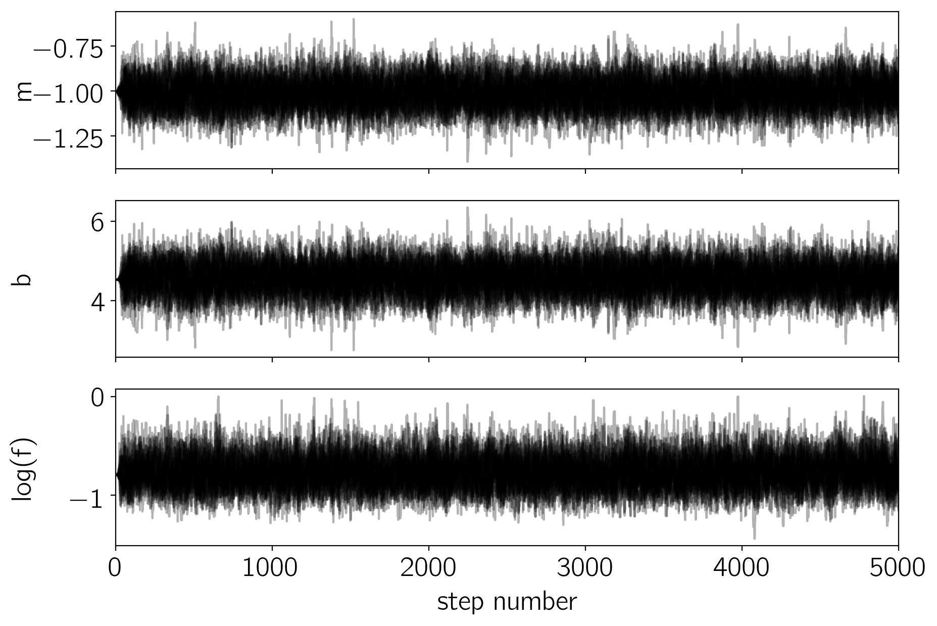
As mentioned above, the walkers start in small distributions around the maximum likelihood values and then they quickly wander and start exploring the full posterior distribution. In fact, after fewer than 50 steps, the samples seem pretty well “burnt-in”. That is a hard statement to make quantitatively, but we can look at an estimate of the integrated autocorrelation time (see the Autocorrelation analysis & convergence tutorial for more details):
tau = sampler.get_autocorr_time()
print(tau)
[35.73919335 35.69339914 36.05722561]
This suggests that only about 40 steps are needed for the chain to “forget” where it started. It’s not unreasonable to throw away a few times this number of steps as “burn-in”. Let’s discard the initial 100 steps, thin by about half the autocorrelation time (15 steps), and flatten the chain so that we have a flat list of samples:
flat_samples = sampler.get_chain(discard=100, thin=15, flat=True)
print(flat_samples.shape)
(10432, 3)
Results
Now that we have this list of samples, let’s make one of the most useful plots you can make with your MCMC results: a corner plot. You’ll need the corner.py module but once you have it, generating a corner plot is as simple as:
import corner

fig = corner.corner(
    flat_samples, labels=labels, truths=[m_true, b_true, np.log(f_true)]
);
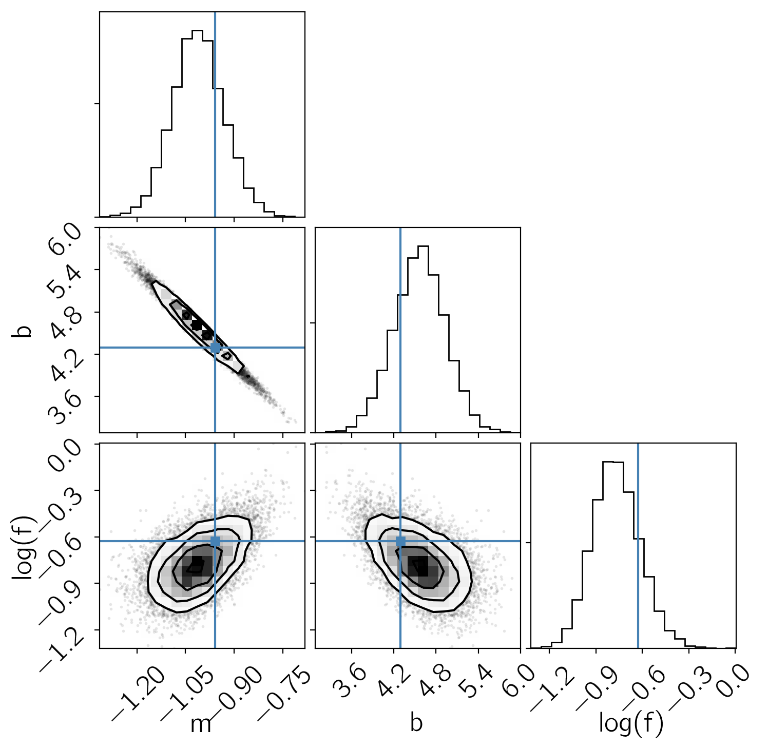
The corner plot shows all the one and two dimensional projections of the posterior probability distributions of your parameters. This is useful because it quickly demonstrates all of the covariances between parameters. Also, the way that you find the marginalized distribution for a parameter or set of parameters using the results of the MCMC chain is to project the samples into that plane and then make an N-dimensional histogram. That means that the corner plot shows the marginalized distribution for each parameter independently in the histograms along the diagonal and then the marginalized two dimensional distributions in the other panels.
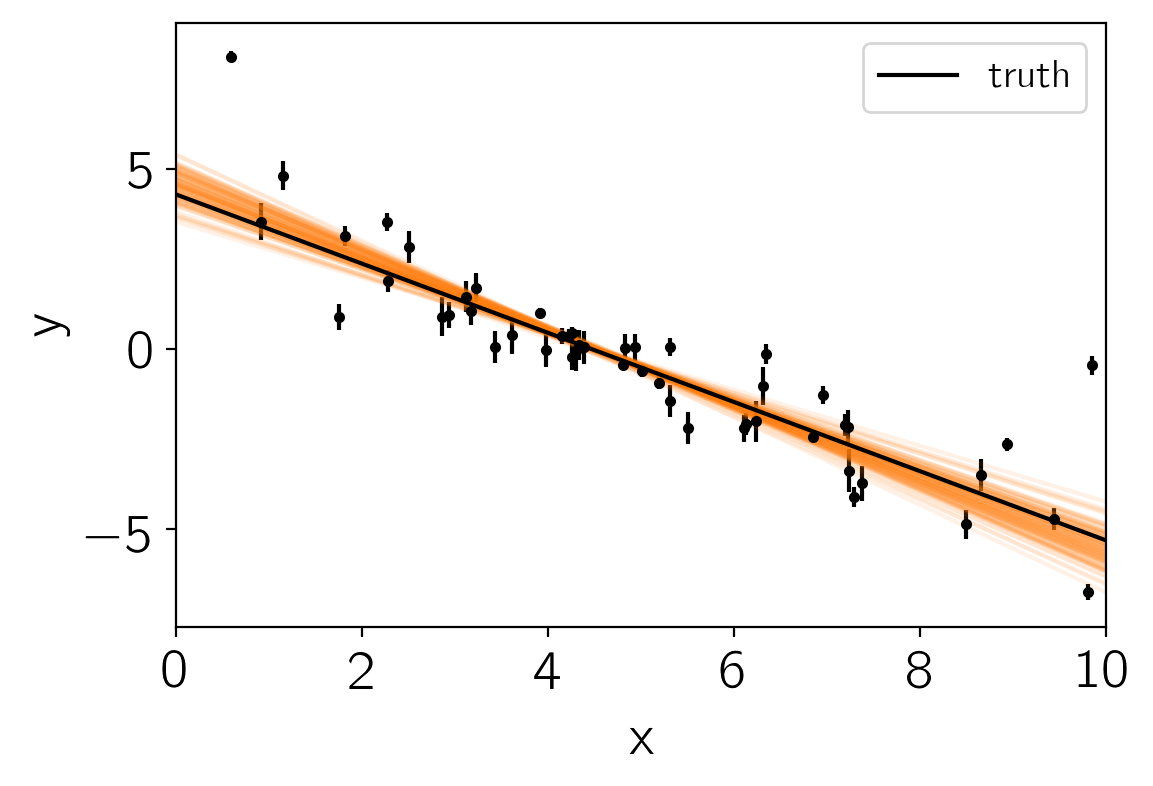
Another diagnostic plot is the projection of your results into the space of the observed data. To do this, you can choose a few (say 100 in this case) samples from the chain and plot them on top of the data points:
inds = np.random.randint(len(flat_samples), size=100)
for ind in inds:
    sample = flat_samples[ind]
    plt.plot(x0, np.dot(np.vander(x0, 2), sample[:2]), "C1", alpha=0.1)
plt.errorbar(x, y, yerr=yerr, fmt=".k", capsize=0)
plt.plot(x0, m_true * x0 + b_true, "k", label="truth")
plt.legend(fontsize=14)
plt.xlim(0, 10)
plt.xlabel("x")
plt.ylabel("y");
This leaves us with one question: which numbers should go in the abstract? There are a few different options for this but my favorite is to quote the uncertainties based on the 16th, 50th, and 84th percentiles of the samples in the marginalized distributions. To compute these numbers for this example, you would run:
from IPython.display import display, Math

for i in range(ndim):
    mcmc = np.percentile(flat_samples[:, i], [16, 50, 84])
    q = np.diff(mcmc)
    txt = "\mathrm{{{3}}} = {0:.3f}_{{-{1:.3f}}}^{{{2:.3f}}}"
    txt = txt.format(mcmc[1], q[0], q[1], labels[i])
    display(Math(txt))